Breathe
On your display
Air quality and pollen from Open-Meteo
- Topic
- Smarthome
- Includes
- Script
Runs on
- Runs on 32×8 (TC001 & DIY)
- Runs on 52×16 (TC002) 52×16 (TC002) version
- Does not run on 32×8 with AWTRIX 3 (TC001 & DIY) Made for AWTRIX NG.
Choose your display in the next step.
Script description
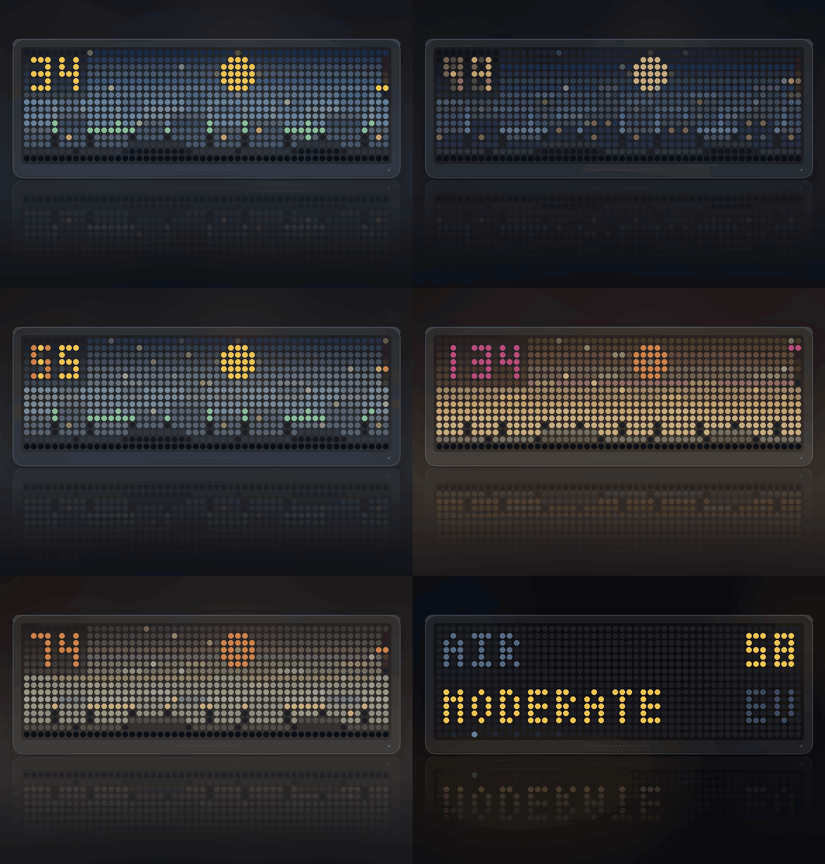
Air quality drawn as how far you can see across the city, with SELECT for what is in the air and which of it is the problem.
Panels: 52x16 and 32x8 · Data: Open-Meteo air quality, no account or key
needed · Scales: European AQI or US AQI
Not a number with a coloured dot
Most air quality apps draw a dial. This draws the view.
Three ranks of rooftops at three distances. On clean air they stand apart and
the furthest is crisp against a blue sky. As the index climbs, each rank washes
towards the sky — the far one first, then the middle — until only the near roofs
are left in a brown soup with the sun a red disc behind it.
That is atmospheric perspective, and it is the one picture of air quality that
needs no legend. It is also why the comparison photographs of Beijing or Delhi
always show the same skyline twice.
Smog is brown because the particles scatter the blue out of the light, so
the sky goes ochre rather than grey, and the sun loses its halo and reddens.
Particles drift across the view, more of them the worse it is, horizontally
and in dirty beige.
Windows light up across the two far ranks — sparsely in daylight, most of
them after dark, when the city is all that is left to look at.
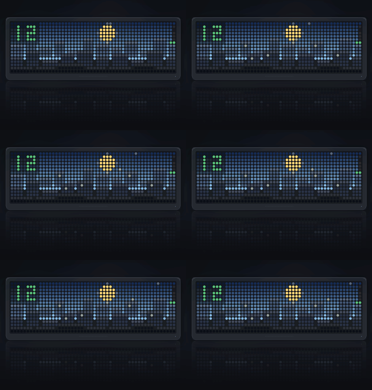
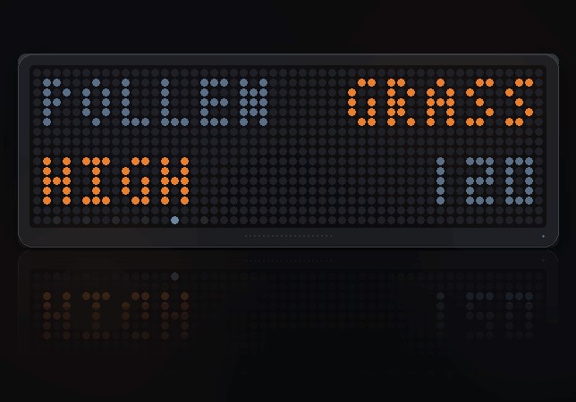
Pollen looks nothing like dirt
When the count is up, yellow-green grains drift and sway across the view,
slower than the particulates and in a completely different colour. A high-pollen
day on clean air looks like a clear blue sky with something in it — which is
exactly what it is, and exactly what the grey haze of a dirty day is not.
Pollen is CAMS Europe only. Outside Europe the API returns nothing for it and
the page says so rather than reporting zero.
A band scale, always on screen
Six marks up the right-hand edge, one per band, with the one you are in lit.
It saves the main screen a word it has no room for, and it shows how close you
are to the next band — which a bare number does not.
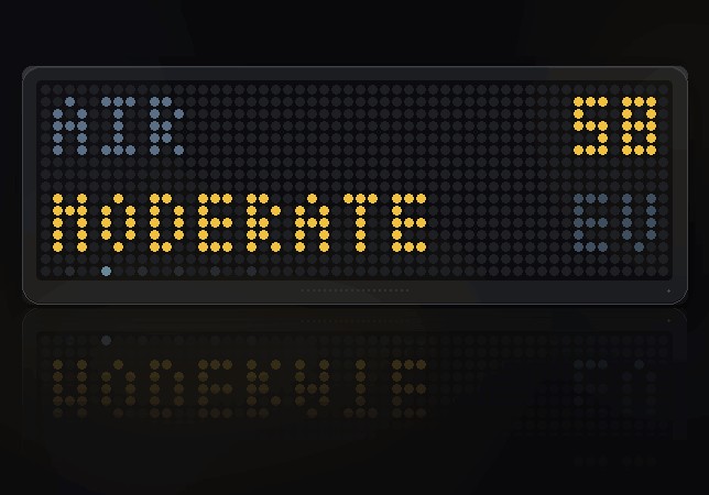
Press SELECT for the rest
Five pages, dropping back to the view on their own after twelve seconds.
What it is
The index and the band in plain words — GOOD, FAIR, MODERATE,
POOR, VERY POOR, EXTREME — plus which scale is in use.
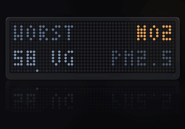
What is to blame
The page this was built for, and the thing nothing else shows you.
The European index is the worst of five pollutants, and which one it is
changes what the number means entirely. Nitrogen dioxide on a still morning is
traffic. Ozone in July is summer smog, and it gets worse in the afternoon sun.
PM10 on its own is usually dust blown in from somewhere a long way away. Same
60, three completely different days and three different things to do about it.
So this names the pollutant, gives its concentration in µg/m³, and names the
runner-up underneath.
Particulates
PM2.5 and PM10, the two numbers people actually recognise. PM2.5 is the one
that reaches the bloodstream.
Pollen count
The species with the highest count — alder, birch, grass, mugwort, olive or
ragweed — its level, and the grains per cubic metre behind it. Out of season it
says NONE rather than listing six zeroes.
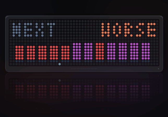
Next twelve hours
The hours ahead as bars, each coloured by the band it falls in, with
BETTER, WORSE or STEADY over them. The number says how bad it is
now; the bars say whether to open the windows later.
When it cannot reach the internet
It says which kind of nothing it got: NO NET (nothing answered), HTTP
plus a code (the server said no), or BAD DATA.
A thin bar along the ground shows how old the reading is. It refreshes every
fifteen minutes, so a full bar means something has stopped working.
Settings
- Latitude / Longitude (52.37, 4.89) — set these first; the defaults are
Amsterdam - US AQI scale (off) — the two scales do not line up at all. 60 is "poor" in
Europe and still "moderate" in America, so each gets its own table of bands
rather than one table and a conversion
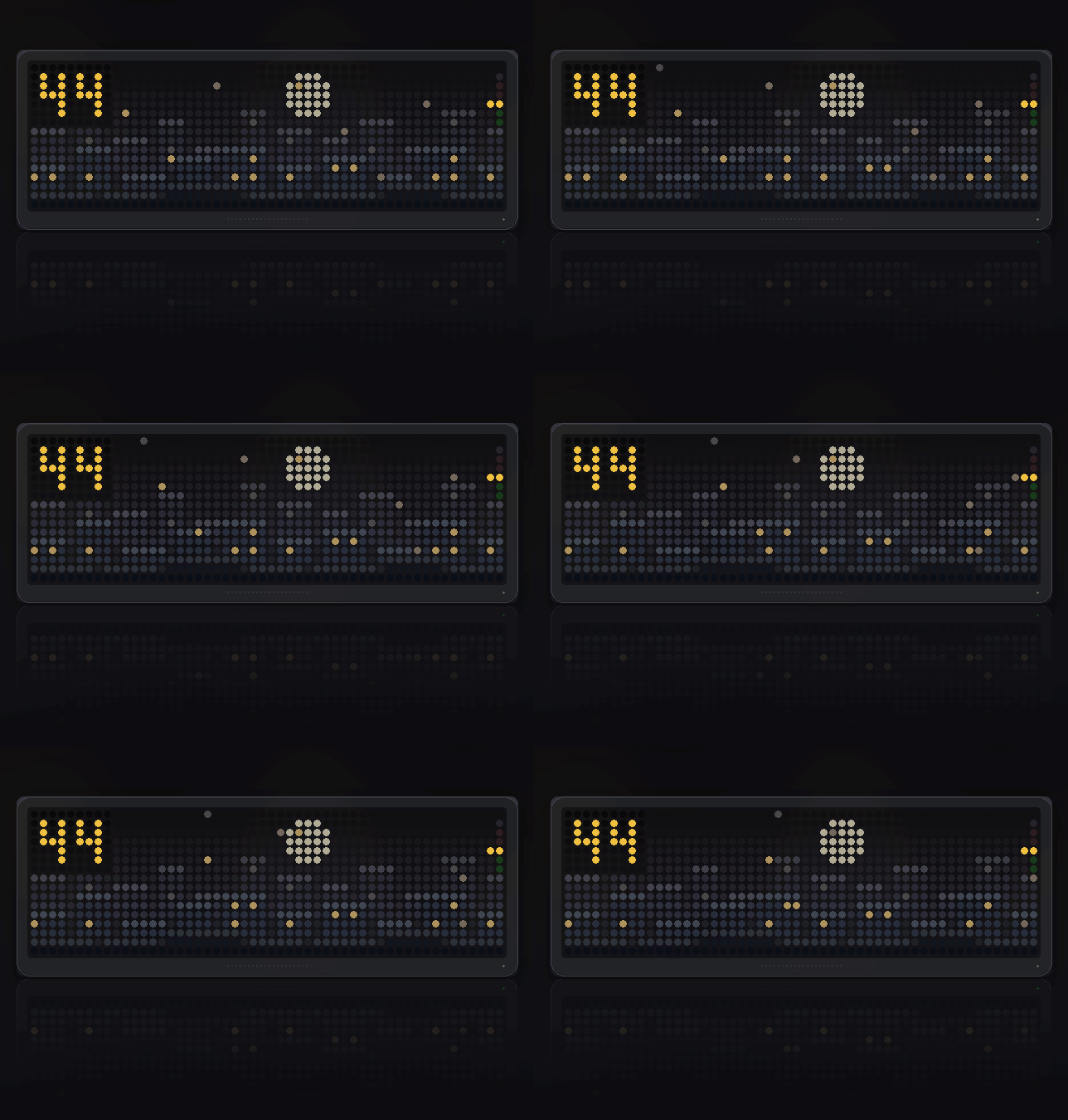
On the smaller panel
Two ranks of rooftops instead of three — on five rows of city, a middle distance
is a row of pixels nobody can place. The readout takes turns: the index for four
seconds, then the band in words for two, shortened to fit.
All five pages are there, and the ones carrying two numbers alternate between
them rather than being squeezed in side by side.
Credits
Air quality and pollen from Open-Meteo, CC BY 4.0,
built on the Copernicus CAMS European and global forecasts.
Sign in to view and copy the code of this script.
Discussion 0
Ask a question, suggest a change or share how you use it.
No comments yet. Start the conversation.
Have an idea?
Sign in to ask questions and join the conversation.