Spot Price
On your display
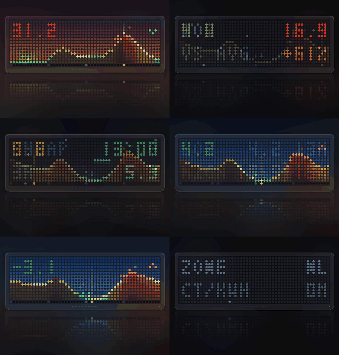
Today's day-ahead electricity price as a landscape you watch the hour walk across, with the cheapest window glowing and SELECT for when to run the washing machine.
- Topic
- Smarthome
- Includes
- Script
Runs on
- Runs on 32×8 (TC001 & DIY)
- Runs on 52×16 (TC002) 52×16 (TC002) version
- Does not run on 32×8 with AWTRIX 3 (TC001 & DIY) Made for AWTRIX NG.
Choose your display in the next step.
Script description
Spot Price
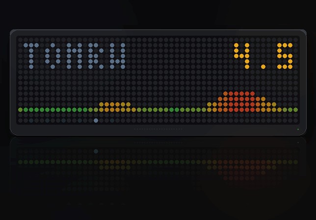
Today's power price as a landscape, with the cheapest three hours glowing and the current hour walking across it.
Panels: 52x16 and 32x8 · Data: energy-charts.info, no account or key
needed · Zones: 33 European bidding zones
Not a bar chart
Most price apps draw a chart. This draws the day as terrain.
Fifty-two columns is a little over two per hour, so the whole day fits the
panel: the overnight trough on the left, the morning peak as the country gets
up, the midday dip when the sun is out, and the evening crunch on the right.
Height is the price, and the colour runs green through amber to red.
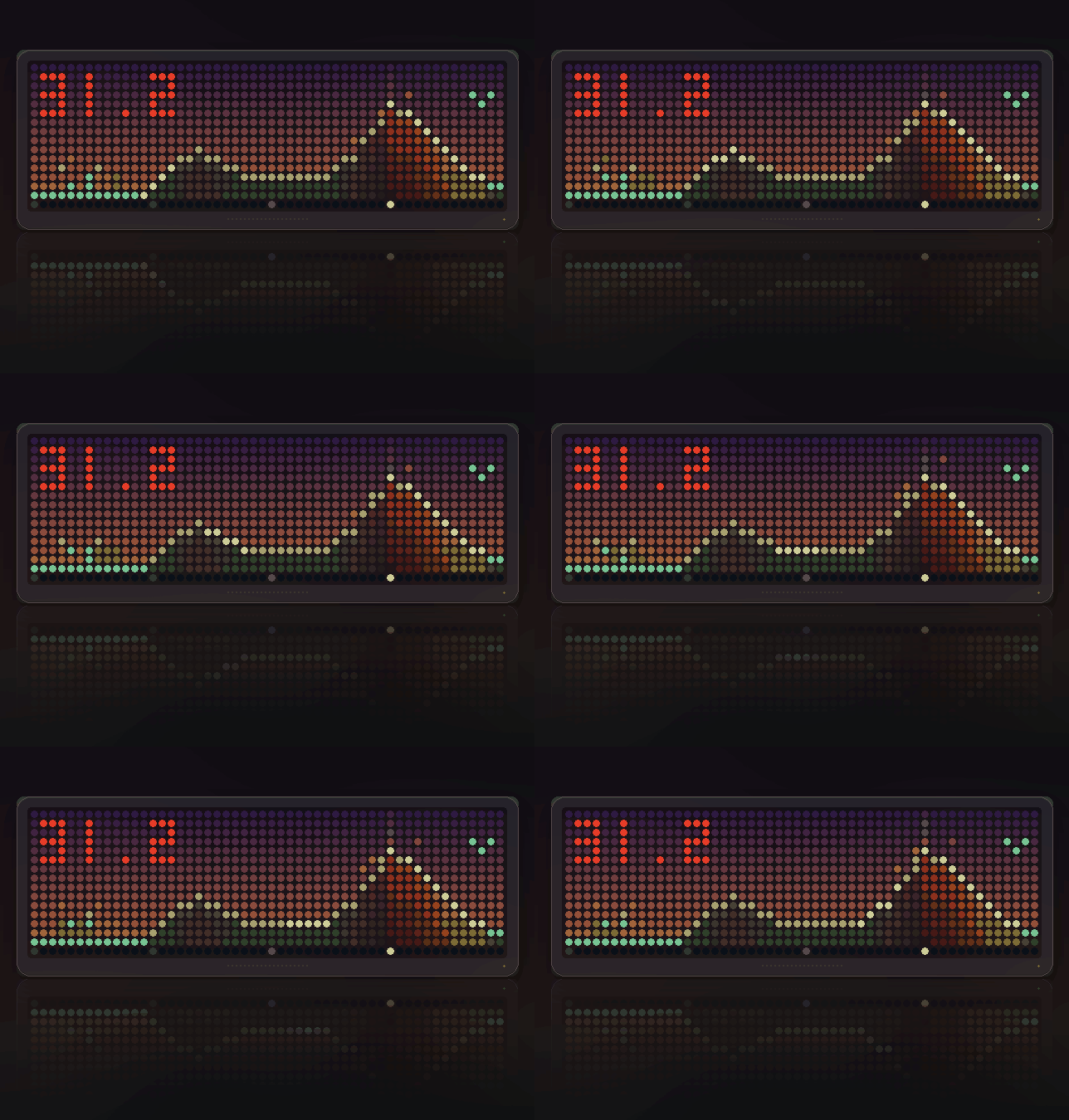
The cheapest three hours breathe. They are the only thing on the panel that
pulses, because they are the point of the panel — and the light comes off them
into the sky, with a few sparks lifting away. A handful of embers drift off the
most expensive stretch, which is the same idea pointed the other way.
The hours already gone are shaded out, so the landscape visibly fills in
over the course of the day, and a shaft of light stands on the current quarter
hour. A glint runs along the ridgeline every few seconds.
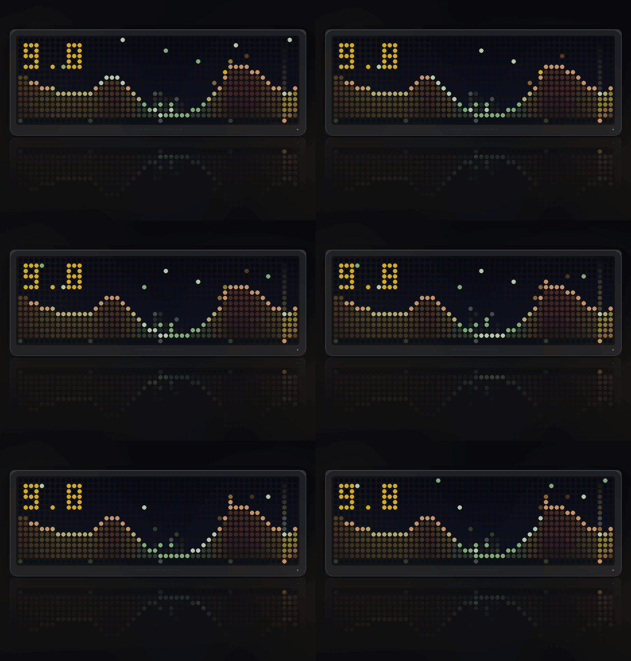
The sky weathers with the clock. It is interpolated between eight points
across the day, so dawn and dusk actually happen and stars come out after
twenty hundred. The same prices look completely different at four in the
morning and at seven in the evening.
When the price goes below zero
On a sunny, windy Sunday the wholesale price goes negative — the market paying
to be rid of the power. Those hours are drawn as a cyan lake with a shimmering
surface, sitting below a waterline, rather than as a differently coloured
hill.
It is the rarest thing the script draws and worth catching.
Press SELECT for the numbers
The landscape is the thing worth looking at, so it stays the main screen and
the rotation always shows it. SELECT steps through five pages, and it drops
back on its own after twelve seconds.
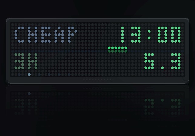
Cheapest window
The page this was built for. The cheapest three hours that have not already
gone past — the day's cheapest stretch might have been at four this morning,
which is no use to you at two in the afternoon. Its start time, what it
averages, and a strip of the whole day with that stretch picked out, so a time
on its own still says where in the day it falls.
Three hours is a dishwasher, a wash, or a car on a slow charger. It is the span
people actually shift.
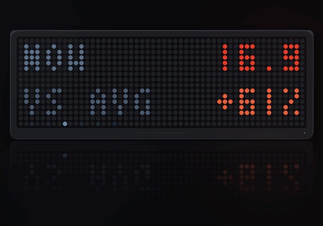
Against the average
What it costs right now, and how far that is above or below today's average as
a percentage, coloured green, amber or red. An absolute price means nothing
without the day around it: forty euros is cheap in January and dear in May.
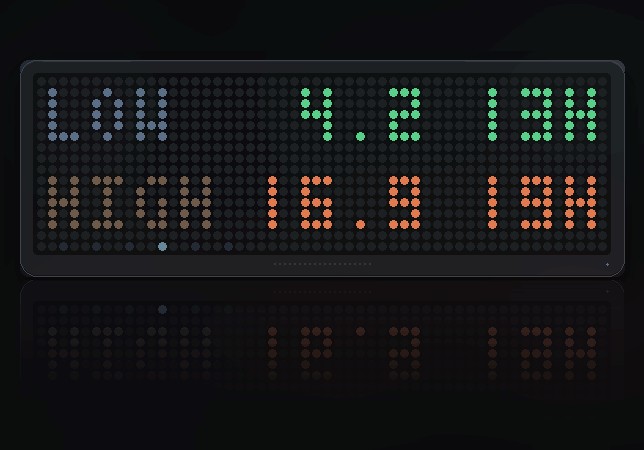
High and low
The day's lowest and highest price with the hour each one falls on.
Tomorrow
The market publishes tomorrow's prices around 13:00 CET. Before that this page
says so. Afterwards it draws tomorrow as its own small landscape with the day's
average over it — which answers the other question worth asking, whether to
wait.
Zone and age
Which bidding zone is set, which unit, and how long ago the prices arrived.
A row of pips along the bottom shows which page you are on.
The main screen number
The current price, coloured by where it sits in the day's own range. It stands
in the sky rather than on a plate: the overnight hours on the left are usually
the lowest thing on the panel, so there is nothing to cover. Where the
landscape does reach up into it, a dark cap is drawn only in those columns —
and the ridgeline is put back over the top, so the day passes behind the number
instead of being cut in half by it.
A small chevron on the right says where the price is going over the next hour.
Why the colours are relative
Height and colour are scaled to today's own range, not to an absolute
scale. You cannot move a load to another day, so "cheap for today" is the only
question worth colouring. A flat, boring day still shows a green valley and a
red peak, because that is still where you should and should not run the
dryer.
When it cannot reach the internet
It says which kind of nothing it got, because they want different things done
about them: NO NET (nothing answered), HTTP plus a code (the server said
no), or NO PRICES (it answered with nothing usable for that zone).
Settings
- Bidding zone (NL) — 33 of them, from Portugal to Finland. Set this first
- Show ct/kWh (on) — off gives EUR/MWh, the wholesale unit
- Add per kWh, before VAT (0) — your supplier's markup plus energy tax
- VAT % (0) — applied after the fee, because that is the order a bill
applies them in
These are wholesale prices
The feed is the day-ahead wholesale market: no supplier markup, no energy
tax, no VAT. In the Netherlands that is the difference between about five
cents and about twenty. Leave both settings at zero and the panel shows the
raw market, which is where the negative hours live; fill them in and it shows
what the kilowatt-hour actually costs you.
For a Dutch household in 2025 that is roughly 10.15 energy tax plus 1.5
supplier markup in the fee, and 21 for VAT — measured on a clock, a 4.7 ct
market price then reads 21.6.
A flat addition on its own cannot do this, which is why there are two fields:
VAT multiplies everything, and it comes last.
None of it changes the picture. Both are monotonic, so the colours, the
ridgeline and the cheapest window are identical either way — only the number
moves
On the smaller panel
Eight rows has five levels of terrain rather than eleven, and no space at all
for a number beside the landscape — so the readout takes turns, as the small
Weather build does: the price for four seconds, then the next cheap window for
two. Space is what is short there, and time is not.
All five pages are there, with short labels, and the ones that carry two
numbers alternate between them rather than being squeezed in side by side.
Zones differ, and it reads which
Most of Europe publishes 96 quarter-hours a day; Switzerland publishes 24
hourly ones. The script works out which from the gap between the first two
timestamps rather than assuming, because 92 points is otherwise either a short
quarter-hourly day or most of four hourly ones, and guessing wrong puts "now"
in the wrong place.
The same reading handles a zone that has only published part of its day — the
Baltic zones were four points into theirs one morning. The stretch that has not
arrived is drawn empty rather than stretching what did arrive across the whole
panel.
Credits
Prices from energy-charts.info, Fraunhofer
ISE, CC BY 4.0.
Sign in to view and copy the code of this script.
Discussion 0
Ask a question, suggest a change or share how you use it.
No comments yet. Start the conversation.
Have an idea?
Sign in to ask questions and join the conversation.